Portfolio | Graphic Design
To explain something visually means to create art that is a projection of
ideas and experiences. These are a few messages I have communicated.
Branding
Social Media
Client: Beezers Gourmet Sandwiches
Work: Original photos and design
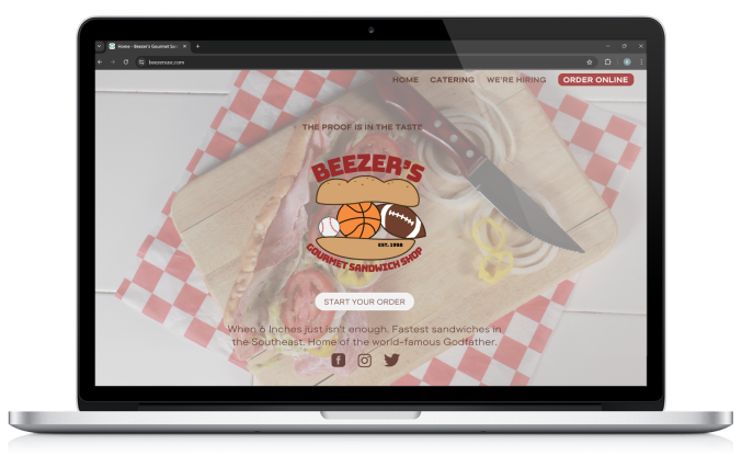
Beezer’s, an existing gourmet sandwich shop, faced an outdated branding that deserved to be brought to life. My team and I ventured into the store to help bring life to their Instagram by capturing the feeling of the shop.
Web Design
Using original photos and logos, Beezer’s is able to spruce up their website. Despite boasting a strong base of loyal customers, a contemporary aesthetic will expand their reach to new audiences.
Social Media Campaigns
Company: Glossier
Work: Original photos and design
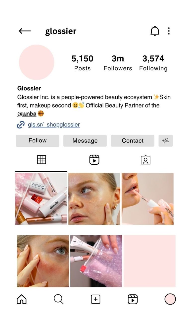
I was tasked with creating content for a large brand in their own style. While doing this campaign, my hope is to bring consistent traffic to their Instagram page through fresh photos. I want women to see a bare faced, unedited woman modeling their products.
Graphics
Pen to paper has always been a comfort to me. As I have begun to expand my visual knowledge,
stylus to tablet has been one of my greatest forms of expressing myself.
Illustrative
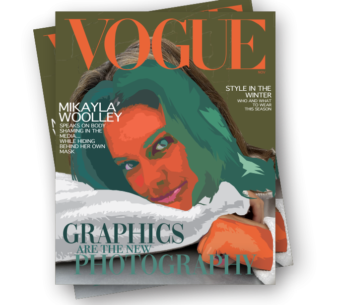
After photographing student Mikayla Woolley, I began using layered colors to illustrate in a way that most fit both her personality and my style of eclectic and abstract art. I aimed to seamlessly blend photography with illustration to capture attention.
Infographics
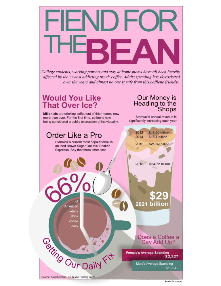
When tasked with designing a coffee-related infographic, I faced the challenge of crafting a piece of work that effectively communicated the way young coffee drinkers have changed the game of coffee. I used coffee grounds for texture, simplistic typography and captivating graphics to make the information easily digestible.
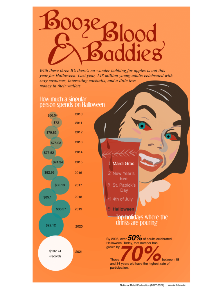
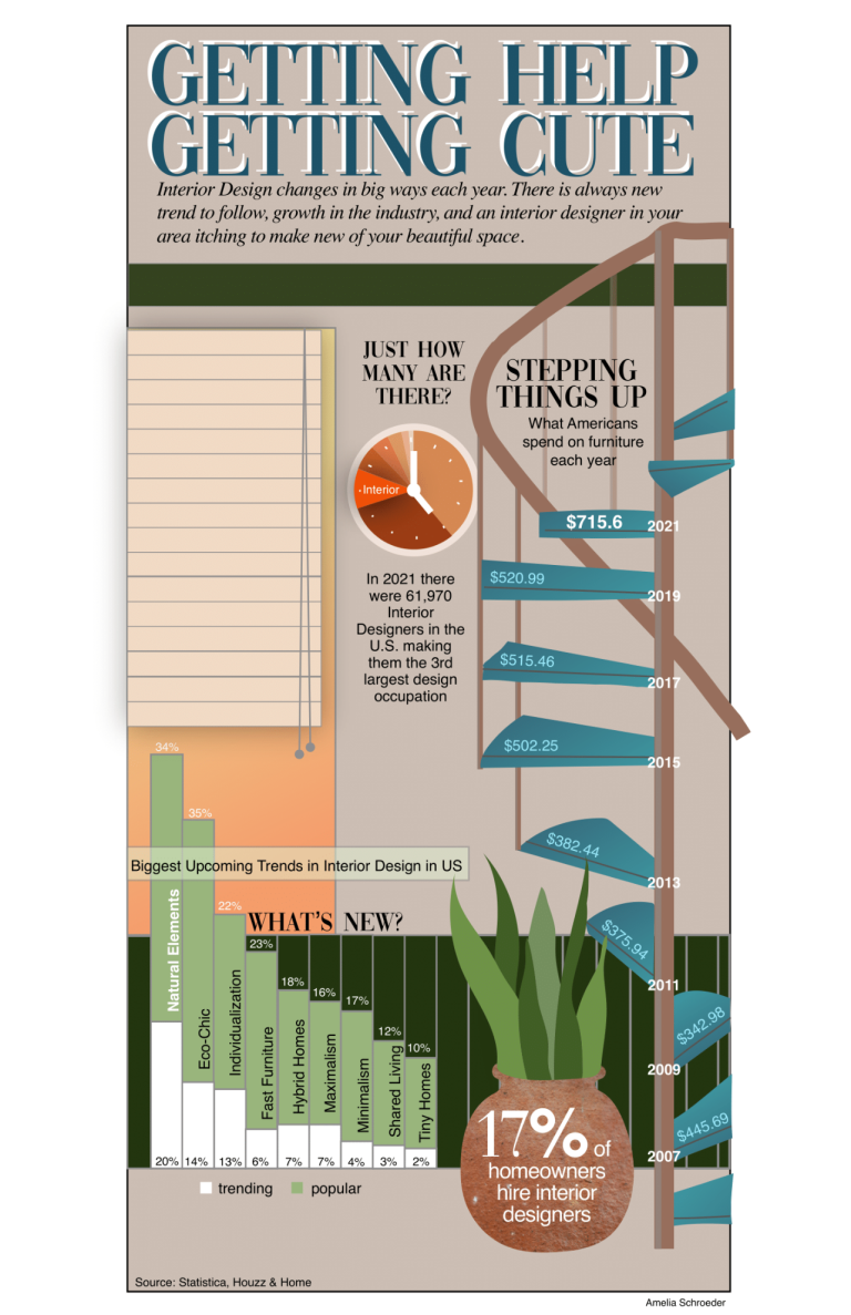
"Getting Help Getting Cute" is a sizable infographic on interior design, presenting a challenge to infuse elements that accentuate my content. "Booze, Blood, and Baddies," is targeted towards young adults celebrating halloween as they continue to change the game of the holiday.
Interface
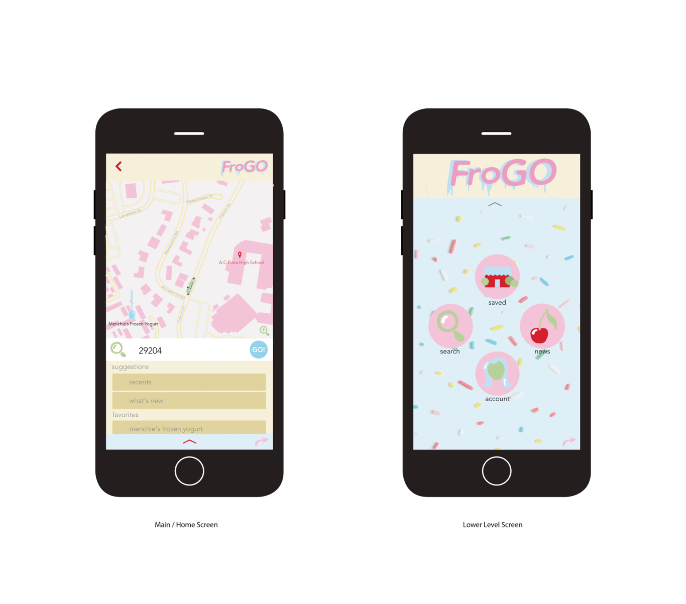
Frogo is a hypothetical mobile application tailored for teenage girls, providing them with
a convenient platform to select and locate their preferred frozen yogurt spots. I worked to
create a playful UX interface design that would fit the idea of a user friendly, candyland inspired app.
Logo
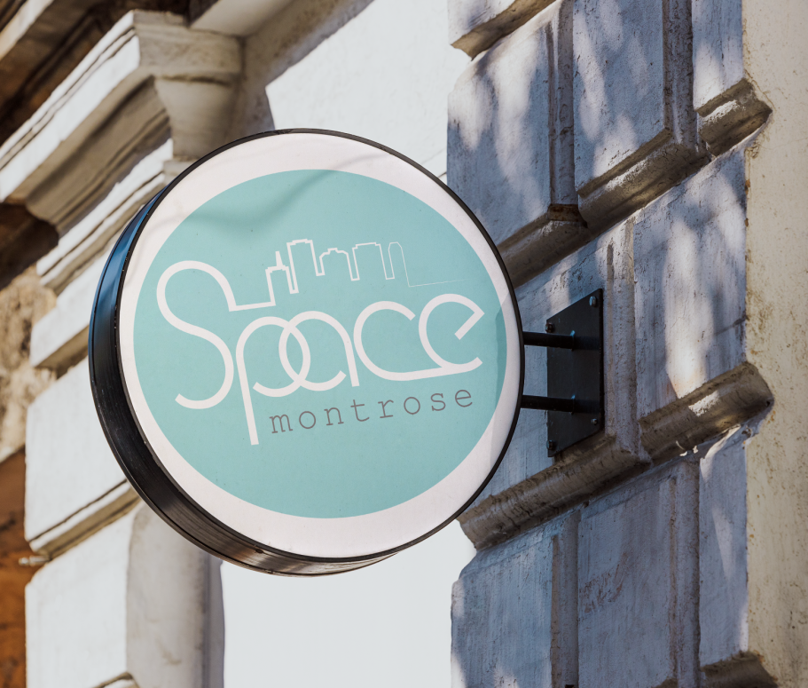
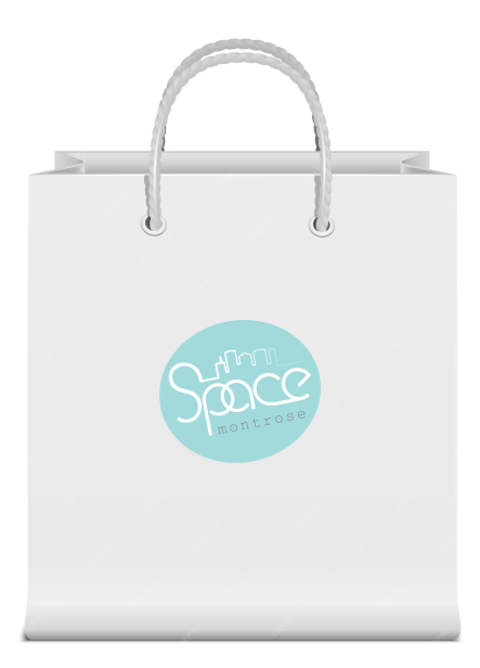
Inspired by Space Montrose, a local boutique store in Houston, I rebranded using a modified version of their existing color pallette, blues and pinks, and inner city, groovy asthetic. I used the new logo to make business cards and store front sign.
Subject: Adidas
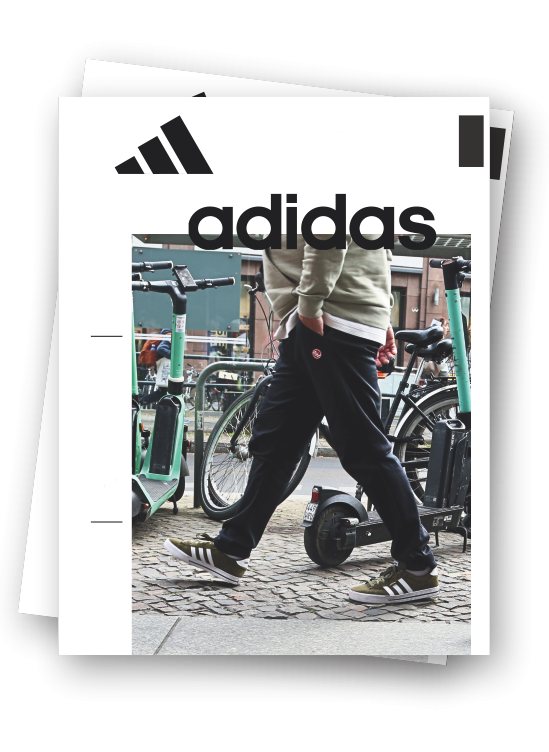
While creating content and videos in Berlin. my team and I constructed a print magazine of everything we learned while researching and experiencing the life of Adidas.
Co contributers; Ali Tunney, Anna Hirst
We need your consent to load the translations
We use a third-party service to translate the website content that may collect data about your activity. Please review the details in the privacy policy and accept the service to view the translations.


